


Issue #: 171
Published: May / June 2020
- Price per issue - digital : 6.50€Digital magazine
- Price per issue - print : 8.50€Print magazine
- Access to Multihulls World digital archives Digital archives
Designing a beautiful magazine cover... is not so easy! Find out how we’ve tried to do it - it's up to you to judge - by following step by step the construction of our visuals.
Published 21/03/2020
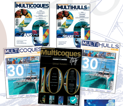
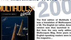
Subscribers OnlyWe didn't really start from scratch as Multihulls World had already celebrated its 20th anniversary, its 30th, and above all its 100th edition on the covers. But that one was reserved for the French edition: Multihulls World n°71 therefore saw a “traditional” cover. Our first choice was to assign the title of 200th edition to both magazines. Ultimately, we’ve opted for a formula relatively close to that of issue number 100.
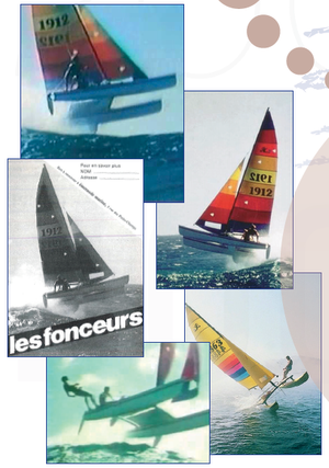
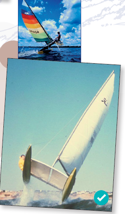
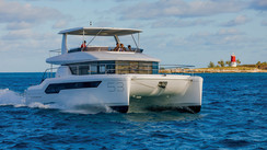
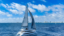
The difficulty is, for such a symbolic edition, to dedicate our cover to a modern cruising multihull - and therefore a specific builder. So, there were two possibilities: multiple images and therefore multiply the number models and the atmospheres, or get down to some graphic design work. We opted for the second option, while trying to avoid all the typical opportunities common to this exercise – birthday candles, patchwork of old covers, etc. - which are not always easy to do. My initial inspiration was this ad for Hobie Cat, with an 18 jumping a wave - remember the famous video. The Hobie is where all of us began - The Optimist and then the Hobie! When we asked the company, they offered us a few pictures from their photo library, and we’ve we stayed with those of the time. My favorite: the view of the Hobie 14 seen from ahead.
 |
 |
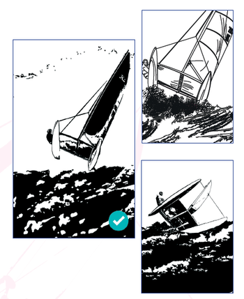
Once the image was chosen, I asked Cyril Richard, a friend of mine - an outstanding helmsman but also a graphic designer - to draw and vectorize it so that Laurent Debacker could work on it at his leisure. There have been three modifications compared to the original: the helmsman has become more visible, the rib has disappeared and “material” has been added so that it’s been possible to frame the catamaran wherever we want on the cover. In the end, Cyril produced two drawings: the one on the photo chosen and a similar composition. Each drawing was proposed at two levels of definition; I opted for the first, in a less detailed version.
I imagined placing the Hobie above the 200, but the first mock-ups quickly convinced me that positioning the hulls of the little catamaran below the 200 was much more efficient. As a result, the heading naturally took its place to the left. All that remains was to choose the typeface for the 200th... and the colors. We started with the background: after dozens of trials, it was gold and silver - obviously festive - then the “menthol” - fresh and modern - which imposed itself. The Hobie was available in light and dark. And the 200? We tried to cache photos onto it but weren’t convinced. The full figures were more visible, more refined. A last attempt with a volcano - in the end slightly blurred - on the menthol background won us over. Water ...


What readers think
Post a comment
No comments to show.